Design it right. Watch conversions follow.
In eCommerce, user experience isn’t optional. It’s the difference between someone buying on the spot or disappearing into the digital abyss. A slick UX helps people find what they’re looking for, check out with zero faff, and come back for more. Bad UX? That means friction, frustration, and cart abandonment.
Here’s how to build an online shopping experience that works for your users and your bottom line.
Start with the user, not your org chart
User-first design means building around how people browse, compare, and buy - not how your product team names categories.
Keep things simple. Navigation should make sense instantly. Pages should load fast. Layouts should help people get from the homepage to checkout without second-guessing. Make sure your brand shows up in the details, but don’t let style win over clarity.
If someone’s confused for even a second, they’re likely already gone.
Navigation should feel natural
Good navigation doesn’t make users think. It quietly helps them get to what they want.
Use clear menus, sensible categories, and consistent filters like price, brand, or size. Show people where they are with breadcrumbs. And steer clear of menu overload — too many options slow people down. Let your menus expand logically and cleanly. No surprises. No hunting.
Most eCommerce sites mess this up. Don’t be one of them.
Speed isn't a luxury, it's expected
Slow sites kill trust. If your pages take too long to load, your customers will bounce before they even see your product.
Compress your images. Minimise code bloat. Use a decent CDN. Prioritise performance on the pages that matter most — especially category pages and product detail views. Every second counts, literally. A single second of lag can cost you 7% of conversions. That adds up fast.
Make categories easy to scan, not a maze to navigate
Category pages are where browsers turn into buyers. They need to be clean, skimmable, and easy to refine.
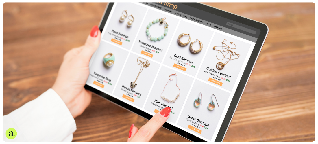
Use a grid layout that lets products shine without overwhelming the eye. Let people sort by price or popularity, and offer filters that actually make sense. No one wants to scroll past 300 results just to find a navy jumper in their size.
Help people narrow it down. Don’t make it feel like hard work.
Product pages that build trust and remove doubt
Once someone lands on a product page, your job is to get them over the line. That means giving them every piece of info they need, clearly and quickly.
Break down key features into bullet points. Add sizing, material, care details, stock levels, and delivery times. Be upfront about returns. Show reviews in plain sight. Skip the marketing fluff and keep things useful.
Good product pages remove hesitation. Great ones turn it into action.
Let happy customers do the talking
Social proof isn’t just nice to have. It reassures, persuades, and boosts conversions.
Show off your reviews. Include star ratings. Pull in user-submitted photos if you’ve got them. Highlight what’s popular or trending. People trust other people more than they trust brand copy. Use that to your advantage.
Checkout should feel effortless
Cart abandonment is sky-high, and clunky checkout flows are a big reason why.
Make your cart icon visible everywhere. Use progress bars to show how far there is to go. Keep forms short and sweet — nobody wants to enter their phone number twice. Be clear about shipping and costs. Offer guest checkout and multiple payment options.
The smoother the checkout, the more likely they’ll follow through.
Design mobile-first
By 2027, almost half of all eCommerce sales will happen on mobile. If your site’s still clunky on a phone, you’re leaving money on the table.
Think big tap targets. Crisp CTAs. Compressed images. Menus that make sense on a small screen. And keep the checkout on one page if you can. Mobile users aren’t patient — your site needs to keep up.
Make it accessible or miss out on sales
Accessibility isn’t just about ticking boxes. It’s about making your store usable for everyone.
Use proper heading structures. Add alt text to images. Ensure good colour contrast. Support screen readers and keyboard navigation. Let people zoom without the layout falling apart.
From June 2025, accessibility will be a legal requirement across much of Europe. So if you’re not on it already, now’s the time.
CTAs that actually drive action
A call to action isn’t just a button. It’s the nudge that gets increased conversions.
Don't forget SEO landing pages
UX and SEO should work together. Landing pages built around high-intent search terms bring people in, but they also need to keep them moving.
Optimise your pages with helpful content, reviews, videos, and FAQs. Use structured data so search engines understand what you’re offering. And align each page with real user intent — not just traffic volume.
These pages often pull in your earnest leads. Treat them like conversion machines.
Personalisation isn't creepy, it's convenient
Done well, personalisation helps users feel understood. It also makes your site more useful.
Show recently viewed items. Recommend based on what they’ve browsed. Tailor homepage content by segment. Use quizzes or filters to guide product discovery. Sync experiences across desktop and mobile.
It’s not about being clever. It’s about being relevant.
Advanced filtering for power users
Faceted search is essential for big catalogues. Let users filter by multiple attributes, show how many results match, and make it easy to reset or tweak filters.
Especially in categories like fashion or tech, if you don’t offer it, they’ll go somewhere that does.
Give people the tools to compare
If your customers are heading to Google to compare options, your site is missing a trick.
Add a comparison feature with clear side-by-side info — price, delivery times, reviews, stock levels. Help people choose without having to leave. That kind of transparency earns trust fast.
UX isn't one and done
No matter how good your site is, there’s always room to improve. Keep testing, tracking, and iterating.
Use heatmaps and click tracking to see where users get stuck. Monitor where drop-offs happen. Test copy, button placement, and image order. Review your mobile UX every month. Small changes can make a big difference.
Your site isn’t finished. It’s a living thing.
FAQs
What is eCommerce UX?
It’s how someone experiences your online store — from browsing to buying. Great UX removes friction and builds loyalty.
Why does UX matter so much in eCommerce?
Because it impacts everything that drives revenue: bounce rate, conversion rate, average order value, and repeat purchases.
Where should I start?
Focus on navigation, site speed, product clarity, and checkout. Get those right, then test and refine from there.
Is UX the same as UI?
Not quite. UI is the design layer — how it looks. UX is the full journey — how it works, feels, and flows.
Do I legally need to make my site accessible?
If you’re selling in the EU or US, yes. From June 2025, the EU’s accessibility laws apply to most online shops.