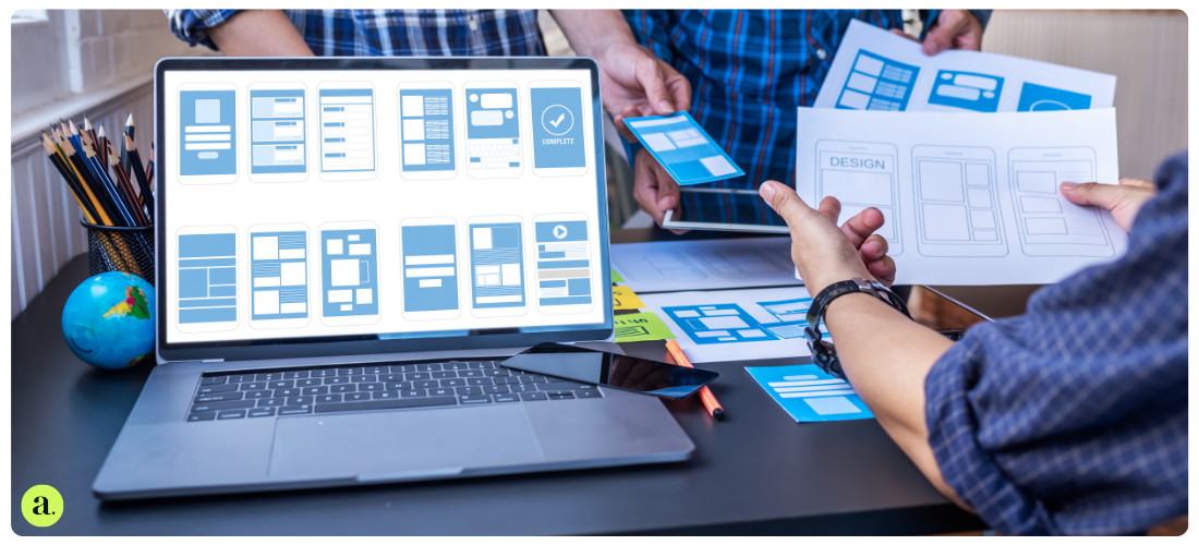
How and Why to Improve UX for Higher Conversion Rates
Conversion problems? Start with the experience.
Want more people to buy, sign up, or click that juicy “Download now” button? It’s not just about the product. It’s the experience that gets them over the line.
Your conversion rate – the percentage of visitors who take action – lives and dies by your user experience (UX). If your site’s confusing, clunky or just plain dull, people bounce. If it’s smooth, engaging and easy to use? They stick around. And they convert.
UX and Conversion Rate Optimisation (CRO) aren’t separate silos. They work together, like two sides of the same coin. Think of UX as the architect, and CRO as the builder refining every detail based on real-world feedback.
And here’s the kicker – smart UX design can boost conversions by up to 200 percent. That’s not fluff. That’s data.
CRO + UX: Built to work together
At first glance, CRO and UX might seem like they’re solving different problems.
CRO tweaks the small stuff – headlines, buttons and forms – to see what gets more clicks. UX maps out the whole journey, from first visit to final checkout.
But the two don’t compete. They complement each other.
UX spots the friction – the clunky steps, confusing layouts or dead ends. CRO tests ways to fix them and proves what actually makes a difference. It’s like tag-teaming a maze. One’s spotting the detours, the other’s paving a faster route through.
Design meets data. The result? A better experience for users and more conversions for you.
Usability: The unsung hero
Without usability testing, optimising conversions is a guessing game.
A/B testing helps you find out what users actually prefer – not what you think looks good. Maybe a shorter form. Maybe a more obvious button. Sometimes, one tiny tweak is all it takes.
Heat maps and surveys are full of clues. They show where people get stuck, scroll endlessly, or just give up. Use those insights to tidy up the journey, smooth the snags and make the whole thing less of a faff.
More ease. Less effort. Higher conversions.
Accessibility: It’s not just legal – it’s smart
Accessibility isn’t just about ticking boxes. It opens the door to more users – and more conversions.
By making your site easier to use for people with disabilities, you’re not only doing the right thing. You’re also keeping more people on-site, reducing bounce rates and giving everyone a fair shot at engaging with your brand.
CRO can help flag up accessibility issues too. Then UX comes in to make those fixes count – whether that’s clearer navigation, better contrast or improved mobile design.
Inclusive design is smart, ethical and good for business. Win-win-win.
Visual design: First impressions count
Looks matter. Especially online.
The way your site feels – the colours, layout, typography, spacing – shapes how people respond. A clean, consistent design builds trust. A messy one sends people packing.
Visual cues, like bold buttons or neat icons, help guide users through the site. A great call-to-action doesn’t just sit there. It pops. It invites. It leads.
And the numbers back it up. A well-designed interface can increase conversions by up to 200 percent. That’s design doing its job.
User-centred design: Spot the pain, fix the problem
Every time a user gets frustrated – whether it’s a hidden menu, an unclear call-to-action or a clunky checkout – you risk losing them.
User-centred design means watching, listening and learning. Ask questions. Run tests. Gather feedback. Use analytics to find where the snags are.
Then fix what matters most. Start with quick wins – the stuff that’s easy to change but makes a big impact. Keep refining. Keep checking in.
When users feel like the site gets them, they’re more likely to stick around. And that trust? It turns clicks into customers.
Mapping the journey:
Want to improve conversions? Start by following the path your users take.
A customer journey map shows every touchpoint – from ad click to thank-you page. It helps you see where people pause, hesitate or vanish completely.
Spot those weak spots, then work out how to fix them. Maybe it’s unclear messaging. Maybe it’s too many steps. Test solutions, measure the results, and keep tweaking.
And don’t stop at the sale. Post-purchase emails, tailored offers and friendly nudges can turn a one-off buyer into a loyal customer.
Call-to-actions and personal touches: Conversion’s secret sauce
A call-to-action is more than a button. It’s a nudge. A prompt. A “this way, please” moment.
Strong CTAs are clear, specific and hard to miss. They use colour, contrast and straight-talking copy to guide the user. No fluff. No faff. Just: “Here’s what to do next.”
Test them. Play with wording, size and placement. Sometimes “Get started” beats “Join now.” You won’t know until you try.
Then there’s personalisation. Show users you know what they need – with tailored content, recommendations or saved preferences. It’s the digital equivalent of remembering their coffee order.
Make it feel personal. Make it feel easy. Watch those conversion rates climb.